Work In The Style Of Henri Cartier Bresson
Final Edits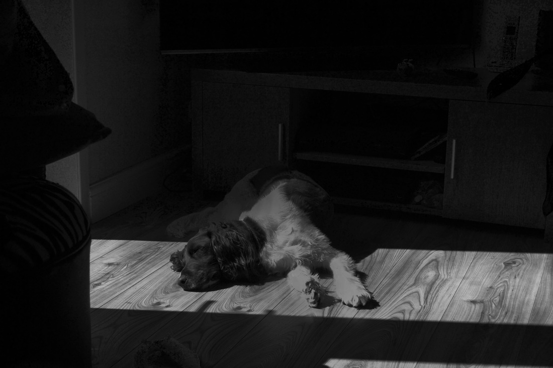
This is my favorite edit of all the photos because of the way the light shines in on the floor and part of the dog and how the photo in general in composed. I like the darker areas of the photo and how it fades onto the dog because it makes the ray of light through the window look sharper and stronger. I also like how the dog looks slightly old fashioned with the faded darkness on top.
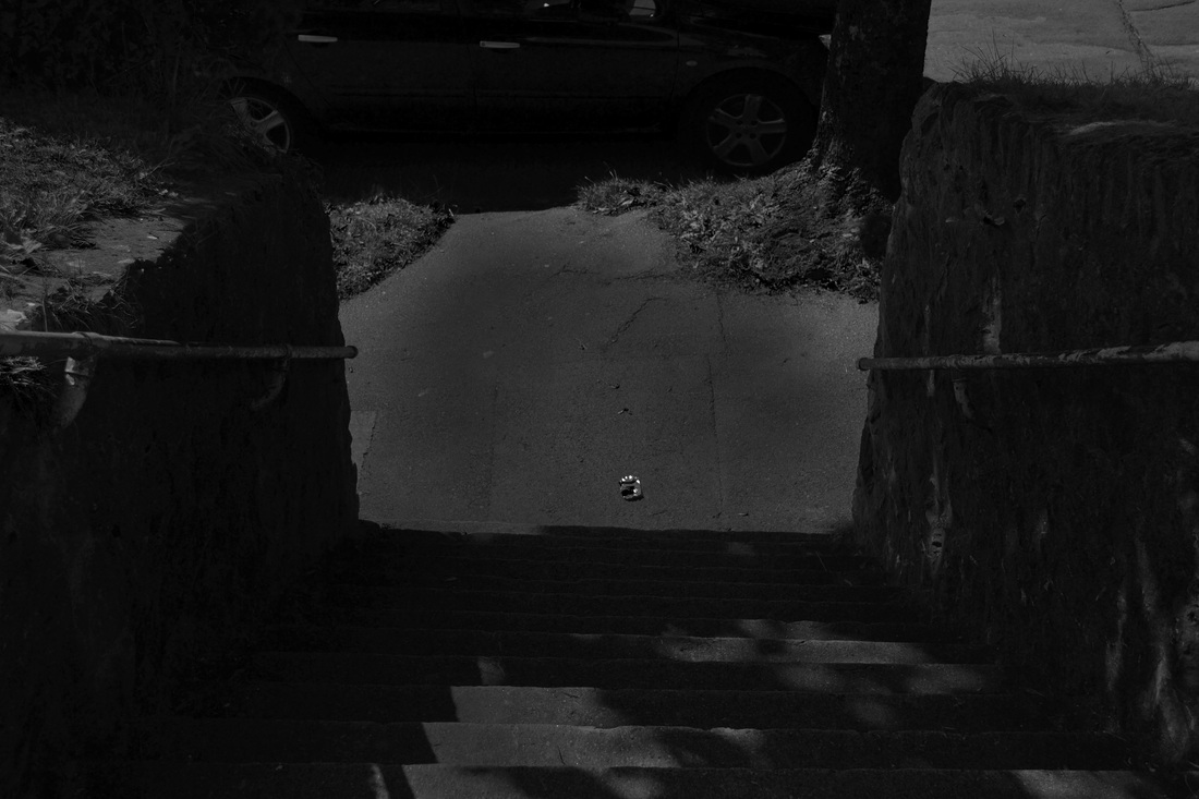
I don't particularly like this edit I have done because I don't really like the amount of darkness I have put in the middle and the brighter areas around it. I feel that that I could of made the edit brighter in certain areas where it's too dark. Another thing I don't like is the way the photo was taken and how the frame was filled.
|
The work I have created in the style of Henri Cartier Bresson was made using Curves, Brightness/Contrast and the Dodge and Burn tool.
I went onto 'Image' on the task bar then selected 'Adjustments'. I then went down the list and selected 'Black & White' which changes the colors black and white but it also lets you change the amount of darkness in the picture. I then fiddled with the darkness of the picture and made it how I liked it particularly. Then after that I used 'Brightness/Contrast' to change how bright the picture is and how dark it can be in general. After that, I used 'Curves' to make certain areas of the picture darker and other areas brighter. Once all that was done, I used 'Dodge & Burn' to darken some of the lighter areas and lighten the darker areas. 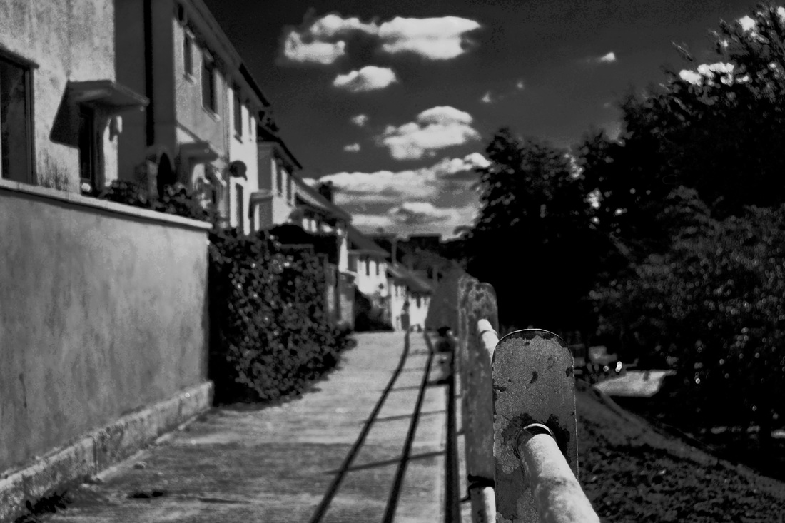
I also like this edit because of the way the camera is positioned to see the row of poles and how its focused on one pole in particular. Another thing I like about this is that the trees look darker which contrasts the lighter pathway making it look better.
|


